


The best part of every website revamp is the transformation. The before. And the after.
It’s like demolishing a house, creating new blueprints, then building out the interiors to be clear, modern, and user friendly.
While I get to see these metamorphoses all the time, they’re rarely observed by the outside world, but I’m changing that with my new Website Transformation Series.
Today, I’m sharing with you the first of many website transformations that I’ll be sharing more regularly from here on out.
And because Halloween is just around the corner (and it just so happens to be my favorite holiday) I put a spoOooOoky spin on it.
Today’s example is all about Challenge Success, one of my clients that just launched their new and improved website this fall.
I’m going to take you through where we started (including the “frightful” parts), where we ended, and the process we followed to get there.
I won’t keep you in suspense…let’s see how I helped transform this website from scary to successful!
Website Transformation #1: Challenge Success
Let’s start with some background:
Challenge Success is a nonprofit dedicated to reducing student stress and promoting well-being by helping families and schools redefine the concept of success.
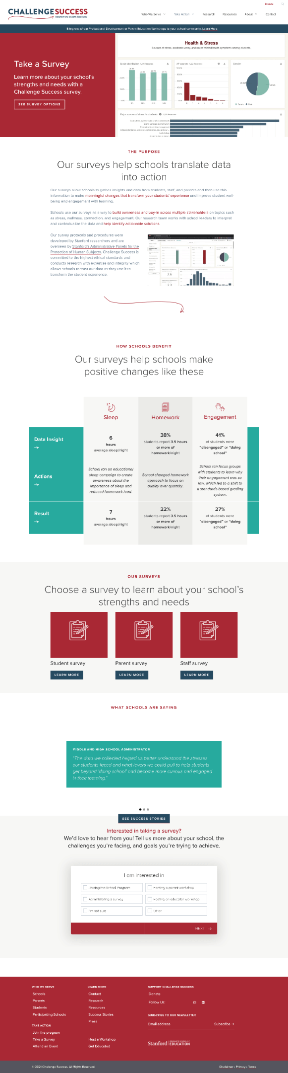
When they reached out in 2020, the company had a working website, but there were several “scary” issues that needed work.
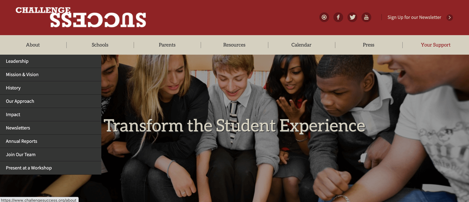
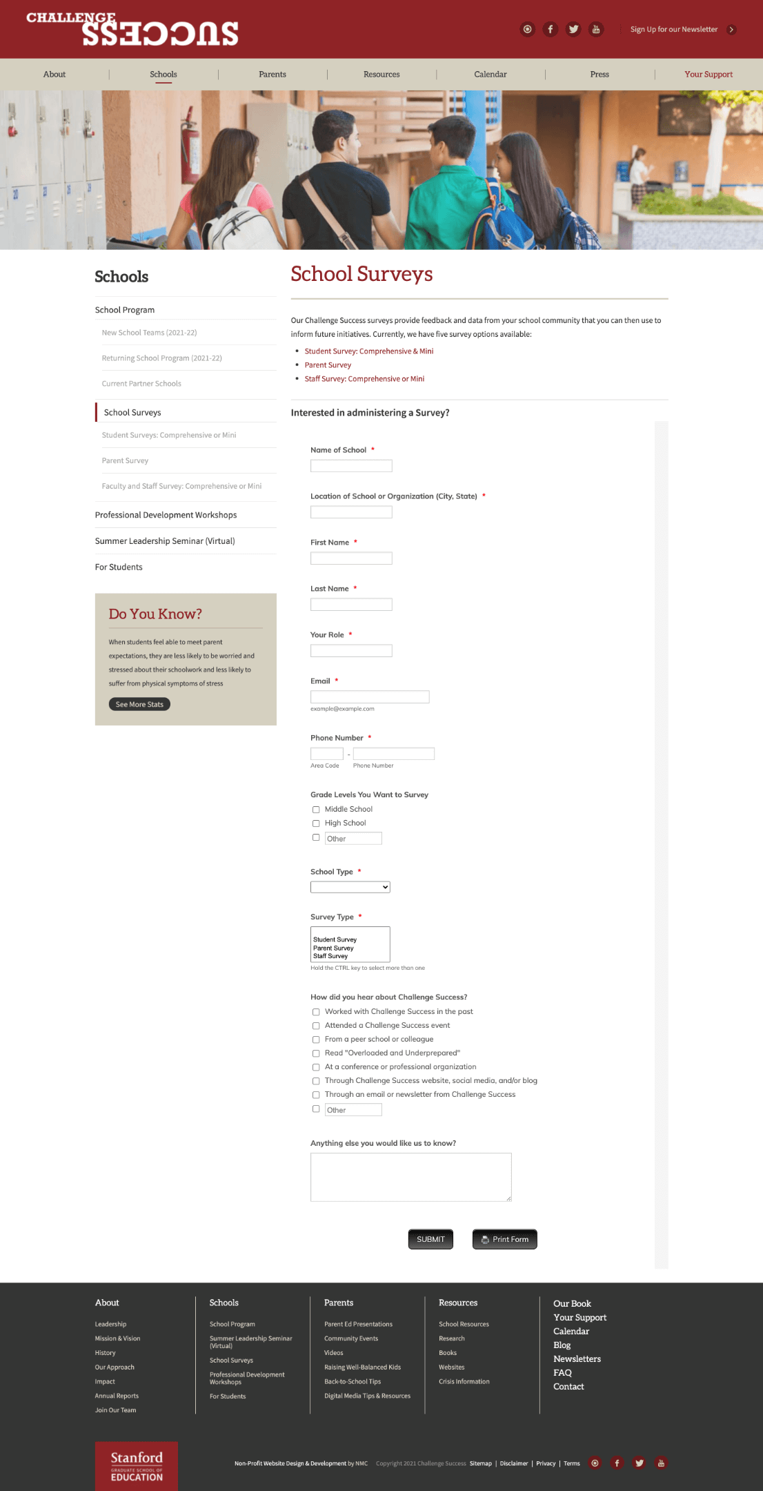
Scary issue #1: Navigation was overly complex and not user friendly
The primary navigation not only had 7 different options (the ideal navigation has 5 elements or fewer), but they also had options within options (think inception but for drop-down menus), which was confusing and created a disjointed user experience.
The navigation also had items that just weren’t necessary (i.e. – calendar, press) and distracting elements like the social icons and newsletter CTA, which are normally accessible within the footer (and users expect to find them there).
Scary issue #2: Unclear, vague copy*
Across the site, the copy was unclear and vague, which is not ideal when you have a more complicated product that requires more explaining and buy-in from different stakeholders (all coming in with differing levels of awareness and intent).
*Note: The client decided to keep this copy for the new website, but we did add some additional copy and visual elements to help clarify the statement
Scary issue #3: Long, clunky paragraphs that did not engage visitors
Instead of using headlines, spacing, bullets, visual elements, etc to keep the copy scannable and engaging, the organization was using long, clunky paragraphs to communicate important information that was likely passed over by visitors.
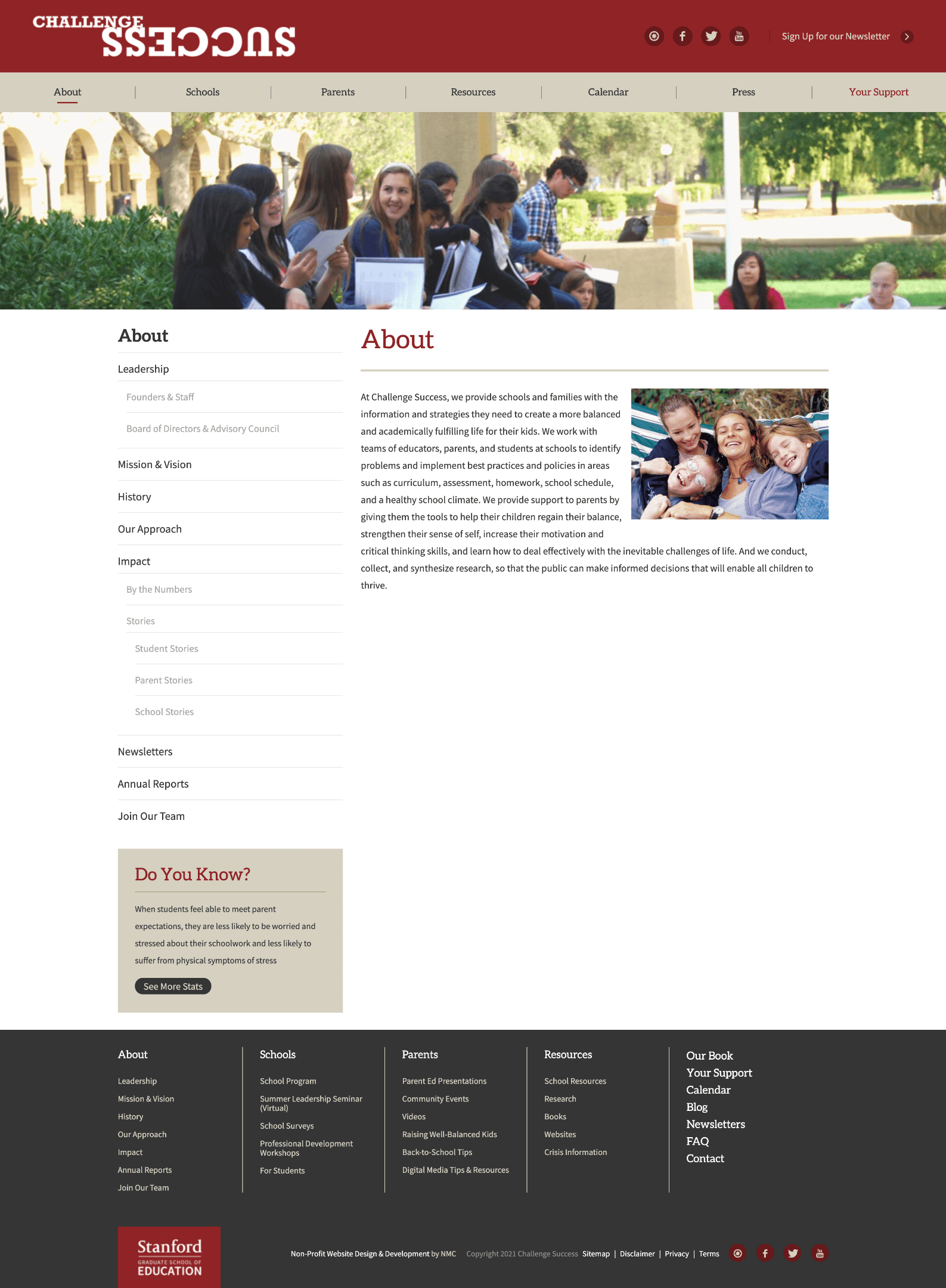
Scary issue #4: Dated design & disconnected content
In addition to the overly cluttered primary navigation, there were also navigations WITHIN the pages (as well as a disproportionate amount of white space), which immediately gave the pages a dated look-and-feel that was not modern or user friendly.
And there were also too many of these pages — for example, instead of having one “About” page, they had separate pages such as About, Team, Mission, History, Our Approach, and others (vs consolidating related information into a cohesive, connected experience).
Scary issue #5: Sales experience was not optimized for conversion
Instead of a traditional sales experience (which typically addresses the challenges and needs of the target audience while persuasively selling the product), the organization was using a series of very long, laborious forms to qualify leads, which likely contributed to drop off and impeded conversion.
Keep in mind, the examples above are just some of the things we were focused on (there were many); if you want even more info, check out the full case study (coming to my site in late November!).
How we went from “scary” to successful
To address the “frightful” issues above, we followed my proven process which involves a mix of research, strategy, and copywriting.
Here’s a brief overview of how the process went for this project:
Step 1: Strategy workshop
The first step was to gather intel from internal stakeholders and the target audiences. To do that, I conducted a strategy workshop with the Challenge Success team, so I could understand the organization’s challenges, goals, and more.
Step 2: Customer interviews
To get a better sense of the target audiences, I conducted 1-on-1 interviews with school administrators, parents, and students so I could clearly understand who they were, their goals, challenges, how they communicate, and more.
Step 3: Usability testing
In addition to the interviews, we also conducted some usability tests on the website so we could understand how potential leads were interacting with the existing site, where they were getting confused or stuck, and gathering feedback for how we could potentially improve the design, messaging, and user experience.
Step 4: Information Architecture
After conducting customer research, I did a site walk-through with the team, I conducted my own site audit and a competitive audit, ensuring I had everything I needed to create a clear and conversion-optimized web experience.
Step 5: Copywriting & design
After the Information Architecture was approved, I filled in each page with copy that was informed by research insights, voice of customer data, ideas from the Challenge Success team, conversion copywriting best practices, and more.
Once the copy was approved, my design partner for the project, Jamie Kleiman-Hardt, translated it into design and development (and she did a fantastic job, as you’ll see in a moment).
Here’s a quick recap of the main improvements…
Again, there were many more improvements that are not mentioned in this article, but these are some of the big ones I wanted to highlight.
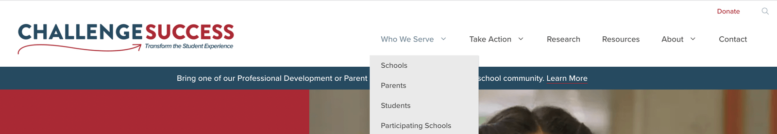
⭐️ Improvement #1: Trimmed and consolidated the primary navigation (and enhanced the user experience)
One of the first things I did during the Information Architecture phase was to rethink the navigation so there would be fewer options and less overwhelming drop-down menus.
The navigation is still pretty robust (I try to aim for 3-5 options in a primary navigation and this has more than that), but this version is certainly an improvement from the original (particularly in the drop-down menus).
Here is the updated primary navigation:

And here is the primary navigation showing the updated drop-down choices within the primary navigation (as you can see, it has far fewer options than the original navigation):
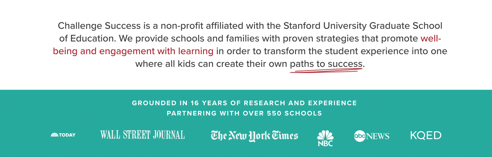
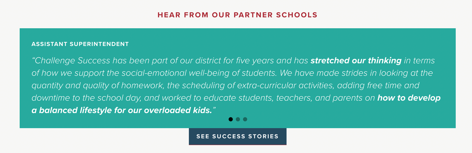
⭐️ Improvement #2: Made the copy more concise & added social proof
While the copy in this example below is still a tad long, it’s at least trimmed down to a more manageable amount of copy (and broken up with visual elements). And hopefully, it’s a bit clearer and more straightforward.
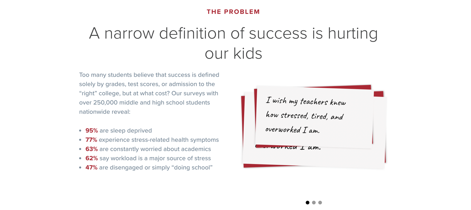
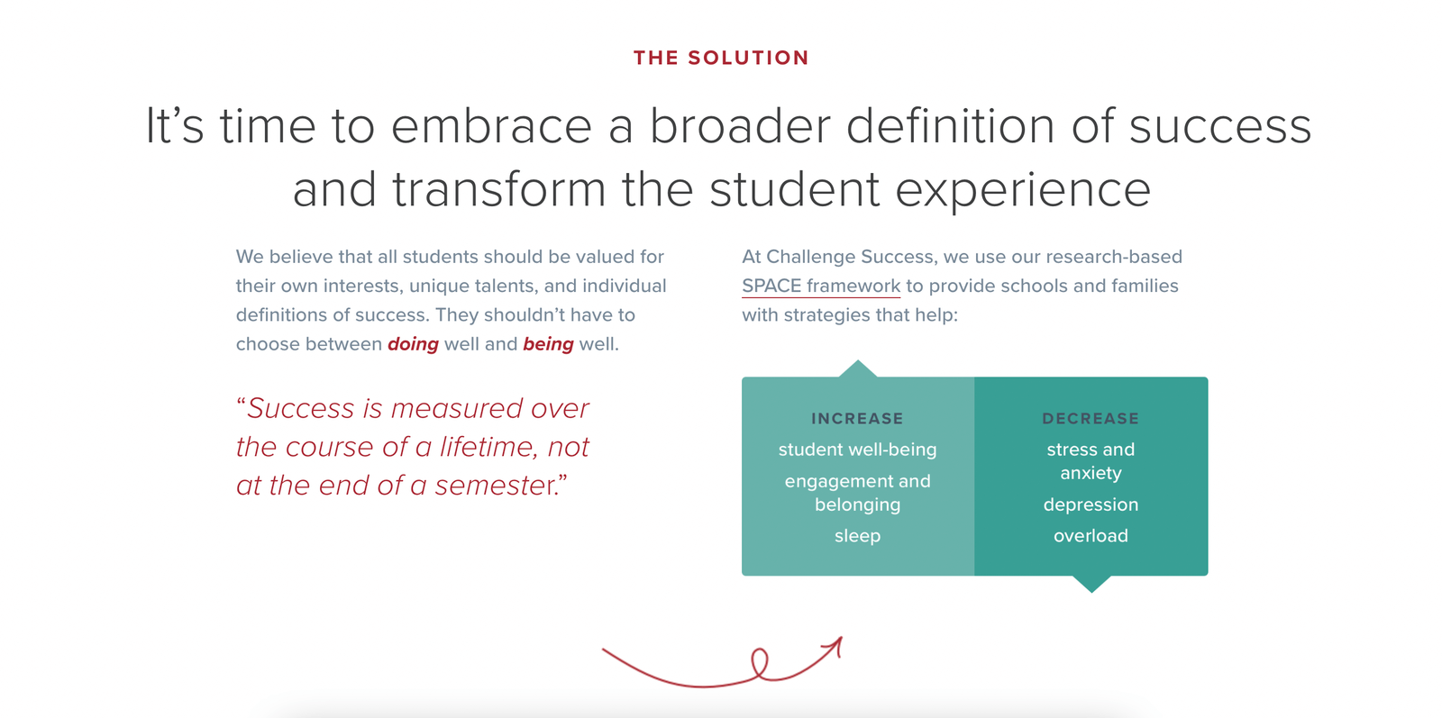
⭐️ Improvement #3: Clearly defined the problem AND the solution (and used visual elements to break up chunky information)
By using bullets and other visual elements, we were able to convey a lot of dense information into digestible, bite-sized sections while also demonstrating empathy for visitors.
It also allowed us to more clearly connect the problem to the solution, which helps from a sales perspective (plus, it helps to clearly explain the product, which was one of our challenges).
⭐️ Improvement #4: Created clear and specific pathways for each target audience
Instead of funneling everyone into the same sales experience, we created specific sales pathways for each of the three target audiences, allowing visitors to easily find the information that’s most relevant to them.
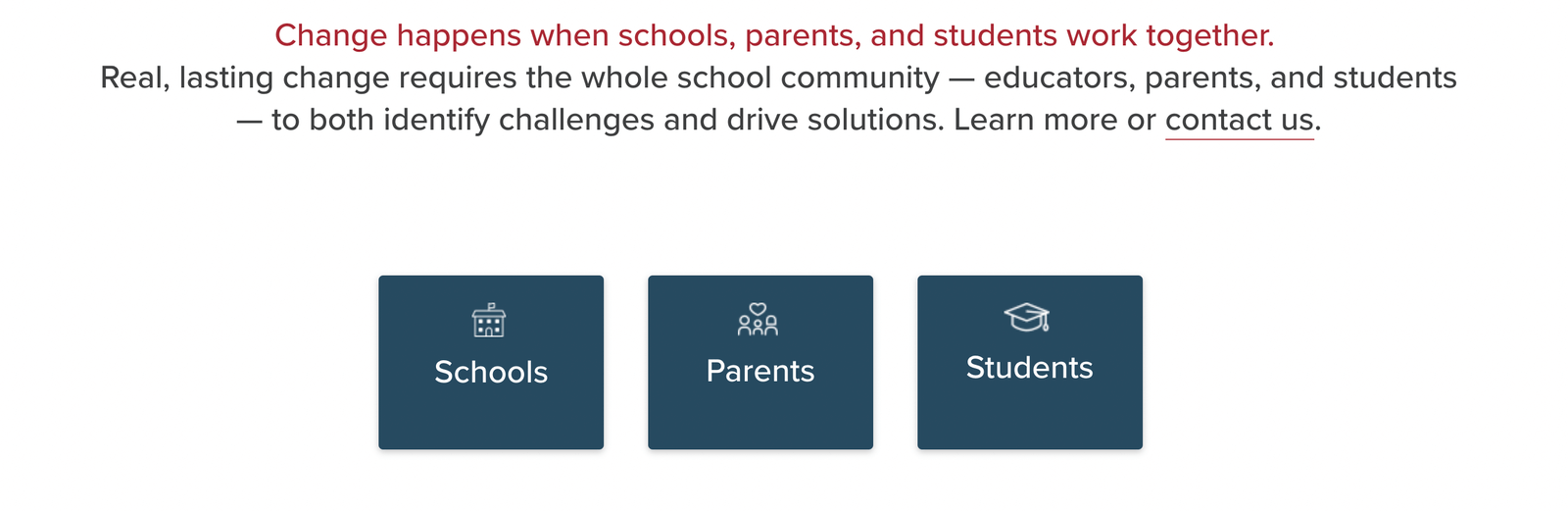
This approach also gave us the ability to create more optimized sales pages, as each one is tailored to the specific needs of each audience (vs sending everyone to one generic page or a bunch of disparate pages that felt disconnected).
⭐️ Improvement #5: Created clear and persuasive sales pages for each of their core products
Instead of just sending people to a long and grueling form, visitors can now learn more about each product, from what it is and what’s included to typical results, fees, and more.
These robust pages are now great educational tools that can help teams get buy-in from key stakeholders (vs trying to parse out the information themselves via a confusing, clunky, and difficult-to-navigate website.
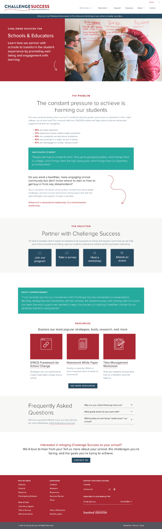
⭐️ Improvement #6: Enhanced the design so the site feels more modern, clean, and user friendly
After developing a new logo, colors, fonts, visuals, and more, Jamie (my design/dev partner for the project) was able to translate the copy into a beautiful, modern, and user-friendly experience (if you compare the new site to the original, it’s like night and day).
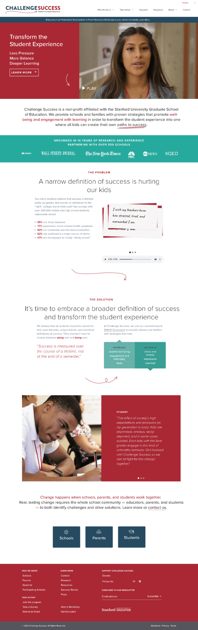
The end result is a website that’s clearer, more enjoyable to use, more valuable for all stakeholders, better optimized for conversion, and built to last (and for a non-profit organization with few resources, that’s a big plus!).
If you’d like to see the new website in action (and check out all of other big and small improvements), click the link above or check it out here.
Is your website scaring off leads?
Don’t let things like unclear copy, a poor user experience, or an outdated design scare off your website visitors.
If you want clear copy that motivates leads to take action (as well as a smooth user experience and modern design), reach out and tell me about your project: annie1maguire@gmail.com
If you’d like to learn more about my services, process, and pricing, check out this article here.
Happy Halloween! ????????


