


Guest post alert! This article was written by Amber Cummings, a digital marketing specialist who’s been making + optimizing websites for over 13 years. You can find out more about her services and experience at AmberMakesMagic.com. Take it away, Amber!
Websites exist for one purpose: to get visitors to take a desirable action.
For some businesses, that “desirable action” may be getting visitors to buy, sign up for a lead magnet, get in touch for more information, or something else entirely.
Regardless, before a visitor completes that desirable action, they must first say “YES!” to your offer. And Conversion Optimization will help you get more of your ideal customers to say “YES!”
But conversion optimization is not just about making changes to websites. It’s about constant testing, as well.
Why? Because we as humans are inherently fallible, and your users are surprising specimens.
You might think your visitors would love a page covered with videos and graphics, but in reality, that may actually overwhelm them (in fact, they may prefer a plain white page with nothing on it but a form — such things have been tested and proven to be true).
You might think your hero headline is funny, but your customers might find it offensive. That’s why testing is critical. If you make that funny but actually offensive headline change it could drop your conversions. Months later, you’ll be looking at sales numbers, scratching your head, wondering what happened.
By testing website updates, you remove a tremendous amount of risk. You’ll get real data back that unequivocally tells you what your users do and don’t like. You’ll know the exact impact your changes have had on your conversions.
But how do you start? What changes should you test?
In this article, I’m going to share with you the nine conversion factors I consider when conducting a conversion audit, which includes visually investigating a website in search of conversion issues and opportunities.
I encourage you to use this as a guide to generate great ideas for what you can test out to increase your own conversions!
Amber’s Conversion Framework
When evaluating a website’s conversion issues and opportunities, there are 9 key conversion factors I consider.
Here’s the quick overview of each, followed by a deep-dive.
Conversion Core:
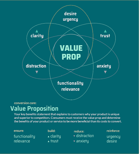
1. Value Proposition: The single most important conversion factor!
This is your key benefit statement that explains to customers why your product is unique and superior to competitors. Consumers must receive the value prop and determine the benefits of your product or service to be more beneficial than its costs to convert.
The 5-Second test: within 5 seconds of glancing at your site can a user easily understand what you sell, who it’s for, and why they should keep reading? Making sure your value prop is prominent (ie: above the fold on your homepage) is the easiest way to pass the 5-second test!
Ensure:
2. Functionality: Everything must work.
Your visitors expect flawless functionality, which means a seamless, bug-free user experience and compatibility across all devices (especially mobile phones) is table-stakes in 2020 and beyond.
3. Relevance: Align with visitor motivation.
Your offer must be relevant to your visitors and match their motivation for visiting your site (the same applies for the marketing messages your visitors saw just before arriving on your site).
Build:
4. Build Clarity: Present yourself in an easy-to-understand way.
In order for visitors to receive your value proposition and benefit statements, the messaging and interface of your site must clearly communicate reasons they should convert in easy-to-understand language. This includes imagery, copywriting and calls-to-action.
5. Build Trust: Show you are a respected company.
We all are wary of scams online, so building trust is imperative. From your look-and-feel to your security messages to your social proof, users must find a wealth of content supporting the security and legitimacy of your site, as well as the quality of your services/products.
Reduce:
6. Reduce Distraction: Make it obvious what users are supposed to do.
If your site is too busy or offers too many options, users can get confused. They may go down a funnel that isn’t aligned with primary conversion goals, get overwhelmed, not take a desirable action, or abandon the site completely.
7. Reduce Anxiety: Address user concerns.
Anxiety is when users feel uncertain and hesitant to take action. This can be caused by anything from bad design to broken forms to a lack of security messages or vague copy that does not address their product questions.
Reinforce:
8. Desire: Add some extra oomph!
Play up your benefits and unique selling points so users cannot resist your offer! Play up messaging for things such as “new” or “exclusive” features.
9. Urgency: Tell users why they should take action now.
Without urgency, users may decide to wait or reconsider. Urgency elements, messages, and incentives encourage them to act now by aligning with their motivation for visiting your site.
Now that you know the basics, let’s go a little deeper on each of the 9 key factors I consider when evaluating a website’s conversion issues and opportunities.
Let’s take a deeper look at each of the 9 factors
Conversion Core:
1. The Value Proposition
Your value proposition is a statement that explains who you are and why you are unique. What do you sell? What are your key differentiators compared to customers?
It may seem obvious, but the truth is, I see websites get this wrong ALL THE TIME.
Why? Because most business owners are too close to their products.
You assume people know things they don’t. You want to be super creative and have some vague headline meant to grab attention, but it’s actually confusing people.
Your customers know your value proposition — ask them what it is
The best way to figure out your value proposition is to speak with your customers. Ask them: “Why do you work with us / buy from us and not another company?”
Then use their exact words – the words your customer needs to hear to convert– on your website and in your marketing messages.
Keep it simple and clear
A value proposition should be concise: we’re talking one sentence.
Let’s look at Slack for a moment.
Their value proposition is “Slack helps you be more productive at work with less effort.” Here’s an example of how they communicate that message front-and-center in their hero headline:
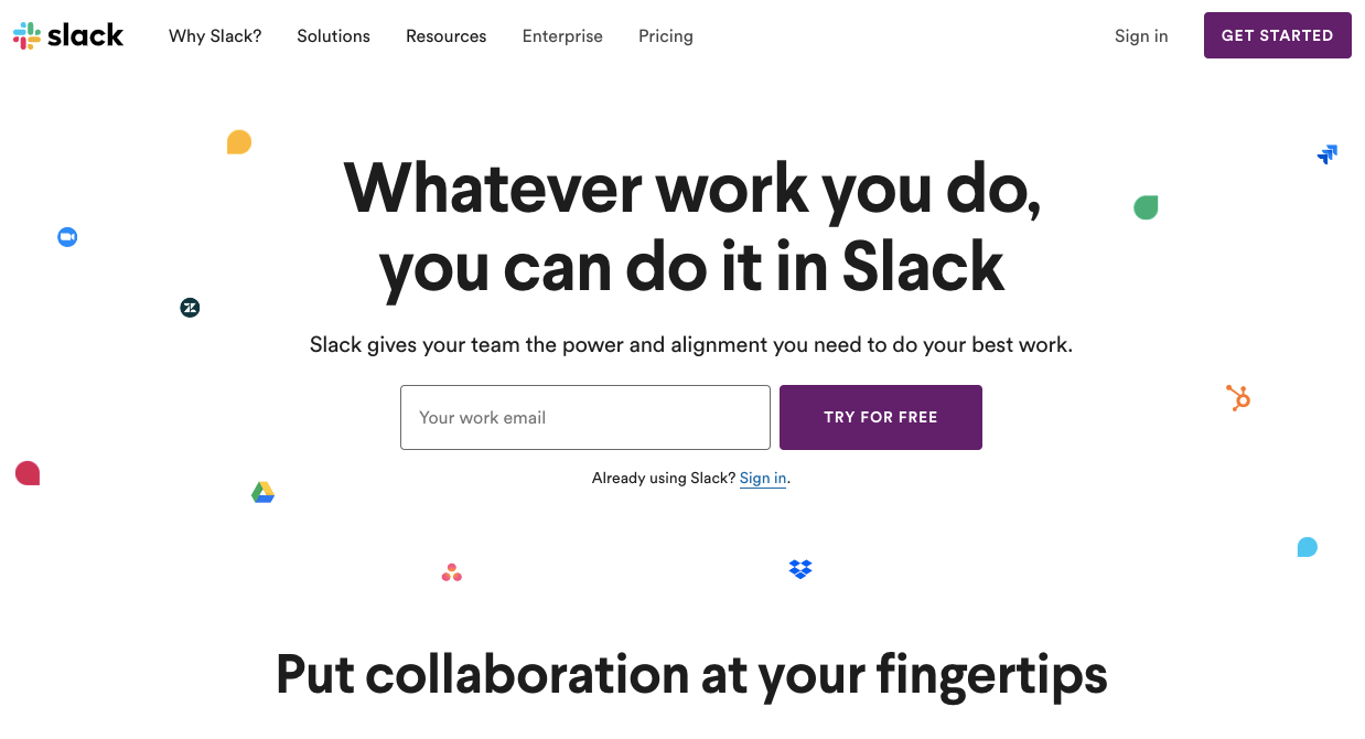
The subhead is what really shines: “Slack gives your team the power and alignment you need to do your best work.”
As a user, I get it: this is a team collaboration tool that lets me do whatever work I do… better. I’m going to keep reading.
Your core value prop is your copy beacon
The value proposition is not just a homepage hero headline. It’s your core messaging strategy; it’s your copy beacon.
If I say this is a tool that helps you do your best work, the rest of the page should explain how by showing features and customer stories that demonstrate people doing their “best work” in action.
The message starts on your homepage hero, but it also needs to be reinforced throughout the rest of the page and throughout the entire site.
The 5-Second Test
There’s a rule of thumb in the conversion industry that the average web visitor will evaluate a web page for 5 seconds before deciding if they will bounce, or if they will stay and engage with the website.
You probably do this, too!
When you’re browsing for something: Have you opened 5 links before, glanced at all of them and then, in just split seconds, determined which you’ll engage with? Me too. And your customers are doing the exact same thing.
As an online business, you must be cognizant that you literally only have this 5-second window to hook a user browsing your site.
In 5 seconds of glancing at your site, a visitor needs to be able to understand who you are, what you sell, and why they should care. If they don’t understand the site or it’s not appealing, they’ll just leave.
Extra love to the homepage hero
Having a great value proposition and communicating it at the top of your homepage is one guaranteed way to pass the 5-Second test.
I have a client whose original homepage hero did not clearly state what his product is and why it’s the best. By just creating a clear value proposition and updating his hero headline and sub-copy, he was able to increase clicks on the homepage hero CTA button to their top-selling product by 27%!
If you don’t have a clear value proposition communicated in your homepage hero section, make that change now.
ENSURE:
2. Functionality
Your site must work and it needs to be easy for a user to take your conversion action, whether that action is buying a product, filling out your lead generation form, or whatever your desired conversion action may be.
This sounds incredibly basic, but we’ve all run into a form we couldn’t submit or stumbled upon a 404 “page not found” page, right?
If you don’t have a functional site, many users will simply leave. Being bug-free is table stakes for conversions.
In 2021, your visitors are expecting a truly great user experience, which means an intuitive navigation, easy check-outs, seamless flows, and a beautiful interface.
If it’s extra easy to go through your check-out flow while sitting on the couch browsing on your phone, users might choose to shop with you instead of a competitor who has a clunky shopping cart. Conversely, if a user is struggling to accomplish something on your site they’ll be irritated and leave.
Do basic QA
You can do a basic QA by clicking through your site, making sure all buttons work and all forms are functional. However, users are really good at finding the mistakes QA misses.
Here are a few auditing tactics that can better help you uncover hidden functionality issues:
- Look at your analytics. See where users drop off in the conversion flow, shopping cart or form flow. If you have an odd drop-off in users, go hunting! You might have a bug.
- Watch users go through your conversion flow. User testing is SO helpful; I recommend it for all customers, especially if you have a multi-step shopping cart or lead generation form. You’ll see them doing things that surprise you! You can use TryMyUI for an inexpensive way to run your own user tests, or tools like CrazyEgg and Hotjar offer session recordings where you can see users going through your flows.
- Pay extra attention to your mobile/responsive experience. Mobile is always a little bit tougher than desktop since you’re asking users to do a lot of form filling and clicking on a small screen; that means this flow needs extra love!
Site Speed:
Ideally, your pages should load in less than 2 seconds.
Site speed and page load speed is an important part of conversion optimization because literally every additional second of load time is costing you conversions (ahem, MONEY).
Website conversion rates drop by an average of 4.42% with each additional second of load time (between seconds 0-5). (Portent, 2019)
The good news is, improving your site speed will bring swift and impactful benefits! In 12 case studies conducted by HubSpot, they found decreasing page load time increased conversions by anywhere from 3-17%
Not sure what your site speed is? My personal favorite free site speed checker is GTmetrix, but you can also get this information from Google’s Site Speed Checker.
3. Relevance
When a user arrives on your site, your offer must both meet their internal motivation and their expectations.
You can’t do much to change what a user is looking for. If they’re shopping for pink fuzzy socks in Arizona and you sell flooring products, it’s highly unlikely that you’ll be able to sell them a polished concrete floor because they just don’t need one.
However, if a user IS looking for someone to install a polished concrete floor, you can definitely ensure that when they arrive at your site, it’s relevant for them and speaks exactly to their needs and motivation.
Where did your user come from?
When looking at relevance it’s important to consider your traffic sources.
If a user clicks on a Google ad that says “Beautiful Floors” and arrives on a landing page that says “Beautiful Floors,” that’s a super consistent experience offering them high relevance.
But if they click on an ad that says “Beautiful Floors” and land on a page that says “Buy Fuzzy Socks” they’re probably going to be confused and leave.
Audit your paid and organic traffic messages to ensure that they’re aligned with the headlines and messaging that users see on their landing page from those sources to increase relevance.
Make sure creative is customized for your audience
Relevance also means appealing to your target audience. Does your design and messaging align with the gender and attitude of your particular visitors?
For example, pink fuzzy socks are likely targeted at a female audience. If I have a stern-looking army captain wearing camouflage as the hero image for my fuzzy socks sales page… it probably will not work. I want a girl wearing fuzzy socks cuddled up on the couch with her cat, preferably with pink colors and maybe some glitter, right?
That image will absolutely not work to sell beautiful floors. On my beautiful floors site I likely want a more gender-neutral design and color scheme. I want photos of gorgeous floors. I could potentially keep the cat as long as he looks glam on the floor. 😉
Personalization
New personalization tools and tactics are amazing for increasing relevance! Personalization can include anything from having a customer’s name appear on the page to showing the product they just checked out.
Location-based personalization is extremely effective if you have a product that is available in a certain area or physical stores. Show users the name of the location on the page, or show them options available in their area!
Build:
4. Clarity
When a user lands on your site, remember that they have to instantly understand what you sell and why it’s great. It’s amazing how many websites do not clearly state exactly what they sell!
I’ve seen a beautiful, artistic hero with a photo of a chair and a headline alluding to craftsmanship and had to scroll halfway down the page, gathering clues, before I understood that the company sells custom-made furniture.
If you want to have a foofy headline, at least say what you do in your subhead.
Clear instructions
Beyond clarity in expressing what you do and sell, you must make it clear to a user the action they are being asked to take on your website.
Is there an obvious call to action in your hero? Are there calls-to-action spread throughout the page, leading them to deeper content? Try to conclude every section with an action your reader can take to convert or learn more.
Once your user is ready to convert, is the path to conversion crystal clear? Can they easily find the “buy” or “contact” button? Are there easy instructions if you have a multi-step process?
Visual clarity
Clarity is not just about your copy; design plays an important role in keeping everything feeling clean and simple.
Uncluttered, simple design is often the most clear because it highlights only the most important information and the conversion path. The photos and graphics you choose should support what you are saying and selling, with clear images that people can visually understand.
Forms, flows & UX
The entire goal of great User Experience (UX) design is to increase clarity!
Whenever you ask your user to go through a form flow, think deeply about their experience.
What is the easiest order to ask your form questions so they feel the most intuitive? How can you guide them from step to step so it feels easy? How can you clearly communicate errors or issues?
Clear, straightforward forms and checkouts are appreciated by all users (and they communicate their appreciation with conversions).
Fresh eyes
The great enemy of clarity is being too close to your product or service.
Often websites skip over key details or forget to mention awesome benefits because… it seemed too obvious to mention.
Working with a professional copywriter or a consultant can be helpful simply because they offer fresh eyes and may be able to explain your service even more simply than you’re able.
Ask an innocent
A great way to assess your clarity is to hand your website (preferably on a mobile phone) to someone who doesn’t know you or your company and ask them to tell you what this website sells.
If it takes them more than 30 seconds, get worried. You probably have a clarity problem.
5. Trust
Shopping online and providing personal info can be a little scary for users.
How do they know you’re a reputable company? How can they really evaluate your products with little pictures and copy blurbs?
It’s not the same as holding a physical object in a store: touching it, smelling it, tasting it, trying it on. For that reason, you need to add trust elements to reassure users and social proof to vouch for your products.
Examples of trust elements:
- Lock symbols, privacy policy notices, statement of warranties, description of return policies
- “About us” content such as years in business, number of customers/clients, and company stories with emotional appeal
- Giving your company a “human” feel by highlighting founders or employees
- Size, scale, reach of your company
- Awards, specialty training, or certifications
- Make it easy to contact your customer service department, and show your customer service ratings if you have them
Examples of social proof:
- Company reviews or rankings (from TrustPilot or other reputable sources)
- Product reviews and rankings; could be a star system (think Amazon reviews)
- “As seen in” logos of publications where your product has been featured
- Testimonials and case studies
- Social media mentions
Gathering Trust Elements & Social Proof
While it can be time-consuming, it’s worth the investment. A couple suggestions:
- If you have products that customers can review, use a service to gather reviews and collect stars; make sure you ask for a review after every purchase
- If you have a service, ask your clients for testimonials and case studies
- Discover influential people who like and use your products and ask them for endorsements
- Make sure you at least have some social media profiles on the platforms that make sense for your company; if it’s aligned with your business goals, be active on those platforms
- Send samples of your product to prestigious companies with a hope of being featured
- Ask to do interviews and podcasts with relevant publications for your industry
Prime Placement
Once you have trust elements and social proof, they should be featured ALL OVER YOUR SITE!
Make sure that testimonials and reviews are prominent on a homepage and on related product pages. One spot that is very effective to add trust elements is right next to any location where you are asking the user to convert. For example, next to the checkout button you can add security messaging and security logos so they feel extra comfortable clicking:
Another prime spot to add testimonials and trust elements is in your shopping cart flow.
Many conversion optimization specialists have had success increasing client conversions by doing this. That’s because people get cold feet. They decide to buy, but halfway through the flow they drop off. Reassure them at every step with messages from other people reinforcing what a great decision they have made and how amazing the product is.
Reduce:
6. Reduce Distraction
Distraction is the opposite of clarity. Distraction is when elements that aren’t of the highest importance are so prominent that they distract users from your main conversion goals. Visual clutter is a common culprit of distraction; this might be too many CTA buttons or so much information a user has a hard time finding what they need.
We just did an entire section about clarity, so why do I mention this separately? Because you should look at it separately yourself. Specifically look at your site to see if there are major distractions that need to be overcome to create clarity. Here are some common distractions:
Hierarchy
The combination of your visuals + your messaging creates a hierarchy on your page that is a guide for users so they understand the importance of items. Bigger items or items with more contrast are assumed to be more important.
A common hierarchy issue is when all the headlines or buttons are the same size and a user doesn’t know which one is most important.
For example, maybe in your shopping cart the button to “continue shopping” and the button to “checkout” are the same size and color. Optimize this by making the “Checkout” button more prominent, because that’s what you most want the user to do!
By establishing one or two items that are most important, then making the supporting information look supporting, it helps the user consume your page content and take the most desired action.
Colors
You should have a color palette for your site that has a few main colors and one or two accent colors that can be used to highlight things like CTA buttons.
Do not use the rainbow. If everything is bright colors, a user doesn’t know where to look, what to read or where to click.
Calls to Action (CTAs)
It’s easy to get excited and want to offer the user EVERYTHING! However, if you have too many options, a site becomes overwhelming and users don’t know where to focus or what to do.
Have one clear CTA that is your conversion action.
You can have some supporting buttons, but change the color to something less bright and have them look smaller and different so a user can visually distinguish between a “convert” versus a “get more info” button on your site.
Inconsistency
Another major issue is when every one of your buttons says something different.
Do not have a “register” button in one spot and a “sign up” button in another and a “contact us now” button in another spot. That’s confusing, and confusion is distracting.
Decide what your CTA is and use consistent wording everywhere that button appears.
Photography
Make sure that your photos support your copy and give the user information.
If you have a vague, artsy photo and a user can’t determine what is inside it, then it can create distraction. Or, your photo can be so big and bold that it can also be distracting.
For example, if you have a circus photo on a furniture website, a user might sit and stare at the circus photo without understanding why it is on your website. This could be serious. They could forget they want furniture and just leave.
Rabbit Holes
Users can get easily distracted.
For example, when they get to the checkout they might see the field “discount code” and suddenly go back to the homepage to search for discounts, or worse yet, start searching the internet for a discount.
I’ve seen product pages improve conversions by simply removing product options (like sizes) that aren’t available. Look with an eagle eye at your flow for anything that could distract a user.
7. Reduce Anxiety
Anxiety is any type of concern or worry that your potential customers might have about your products or services or the web experience.
It’s the opposite of trust, and once again, I’m mentioning it as its own separate category because it deserves it’s own separate audit.
Maybe you have an online shop and customers worry that they can’t touch the product before buying. It’s hard to know if clothes fit online or if a rug will be the right color when looking at little thumbnails.
How can you reduce their anxiety?
For clothes, a new category that’s now used to assess clothes in reviews is “fits true to size” and you could offer sizing guides. For rugs, you can make sure to have close-up photos of the products and elevate reviews that mention how the color was “exactly what they expected” or showcase user-generated photos of the rug in a variety of homes.
What causes your customers anxiety?
The examples I gave are very product or service-specific, and your particular customers are going to have their own website worries.
The best way to find out what they are is to talk to them. What are their top concerns?
If you have a customer service department, ask what common questions and concerns they have to address. It can be harder to gather feedback online, but there are some tools to help. For example, a live chat tool can help you get feedback, or you could add an exit survey using a tool like SurveyMonkey.
Here are other common causes of anxiety and ideas to help you reassure your customers:
Is my privacy safe?
If I give them my email, will I get hundreds of spam emails? If I give them my phone number, will I start getting junk calls?
These privacy concerns are easily overcome with messaging. Tell users why you need their information and let them know you take their privacy concerns seriously.
For example, next to the email field write: “We hate spam too! We only use your email to send you important messages about your product and will never sell or give away your information to third parties.”
Is this secure?
Customers want to know that they’re working with a legit business, especially when entering data like credit card info.
Put every trust element you’ve got next to your fields asking for this sensitive info.
For example, if you’re associated with VISA or MasterCard or even PayPal, those logos are recognizable and add reassurance. If your website is secured by an SSL company, put the logo there.
Add a lock symbol and put a message stating the security measures you use to protect customer data. Even simply saying: “We keep your information secure in our highly-protected databases” can help a customer feel comfortable finishing their purchase.
What if I hate it?
Another way to address customer concerns like “will it fit?” or “what if it’s the wrong color?” is to offer refunds and guarantees.
If you don’t already offer these to your customers, test it out!
See if people buy more products when you tell them that it’s a risk-free purchase they can easily return if they’re unhappy.
People are much less likely to return an item that’s now in their hands, so you’ll likely come out on top even if you do have a few more returns, but significantly more people make purchases.
Use FAQs and help centers
If you have common questions, post them on the site with answers. If you’ve got a complicated product, create a help forum where users can search for the answers they need.
There are so many tools available now to facilitate a great customer help experience; look at your competitors and check out successful companies both in and out of your industry. Find some examples of companies that excel in customer support and steal their tricks.
Reinforce:
8. Desire
Congratulations! You’ve made it to the sexiest part of this article.
I bet when you read that you perked up a little bit, right? The power of suggestion is undeniable. When I said it was sexy, it immediately became more interesting. And when I congratulated you, well, it felt good! That’s an emotional play, and they work.
Feature what’s awesome
This section is all about ways to create extra desire for your product.
Start by thinking about what is desirable and amazing about what you offer. What benefits are unique, exclusive, best-in-class, new or otherwise special?
Play those things up! Feature what you offer with
flair and hot emphasis.
Make it emotional
Think about the emotions that people will feel when they achieve the desired result from using your product.
Will they feel sexy when they wear it? Will they feel powerful when they drive it? Will they and their family be protected once it’s in place? Will they learn to be the best? Tell them this!
Create that desired emotional vibration on your websites.
A great example of desire in action is McDonald’s slogan “I’m lovin’ it.” Yes, it’s that easy. Tell your users what they will feel when they say “yes” to your offer and they’ll start feeling it.
Show off what you’re offering
Big pictures of the product and images of people using/enjoying/benefiting from it are incredibly appealing.
Photos let you showcase what’s awesome about your product and they’re one of the best ways to create emotional appeal. It’s often well worth the investment to hire a professional photographer and do a shoot.
Extra sizzle for what’s special
These are your marketing-type messages that create excitement. For example, words like “NEW!” or “Best-seller” can attract attention, interest, and ignite desire.
Upsells
Another great way to leverage user desire is to offer upsells.
When a user is in a buying mindset and interested in your products/services they’re even more likely to accept add-ons.
For an ecommerce site, try a “you might also be interested in” product recommendation carousel. If you have a service, create packages that offer users easy ways to choose additional add-ons or levels of service.
9. Urgency
Let users know why they should take action now. Without urgency, visitors may browse your site and decide to wait until later to purchase or they may leave and never come back.
Create fear of the lost opportunity
In general, I like to lean into positive messaging. However, some well-placed fear can be truly effective.
For example, what happens if a user DOESN’T say yes to your offer? They’ll stay stuck. They’ll keep wearing ugly clothes, they won’t be safe. Tell you customers why it’s so important to act NOW.
Missed opportunity cost is real; all the time someone spends waffling could be costing them something: money, safety, confidence…the list goes on.
It’s the same with conversion optimization.
Everyday you wait to optimize your site, you are losing potential customers. Every day you wait to fix that bug in your shopping cart? You are literally losing money!
Those lost customers will buy from your competitors. The bigger your competitors grow, the harder it will be for you to compete. In contrast, the sooner you start, the sooner you start enjoying a higher conversion rate. The sooner you will be making more money you can then invest in your own growth.
Sale
Everyone wants to get a great deal, and sales create limited windows when a customer can capitalize on lower pricing. I don’t have to tell you why sales work; we all love them!
Limited-time or last chance offer
For some products and services, you may be able to add urgency with messages about limited time or limited availability. For others a limited-time promotion like “last chance” may add extra incentive for conversions.
Exit-Pop or email with offer
If your customer is on the way out, why not try one last time?
You can use an exit-pop to give them a last chance offer. Or, if they’ve left something in their shopping cart you could give them a coupon that’s only good for 24 hours to purchase what they’ve saved.
Test Everything
Now that you have all of these ideas, my suggestion is that you go through your site and make a really big list of everything you could possibly test.
Put it in a spreadsheet and use this criteria to organize it:
- How important is this? Flag anything high priority to start. For example, if you have a bug in your shopping cart, that is really, really important to address! It’s critical. If you want to try adding some new elements to a product page, that’s a “new add” and not quite as important.
- What will be most impactful? A change on the homepage or shopping cart will probably impact conversions more than a change on your “About” page, for example.
- How easy is this change to make? Changes that can be rolled out fast take priority!
Organize your list and begin working on new variations. Once you’ve got new creative ready, test everything out. There are many A/B testing tools out on the market you can use, but I always start by recommending Google Optimize because it’s free and it plugs into your existing analytics.
You can group a few similar changes together for a test, but do be careful to not try to test too many things at once. If you change too many items, it can be hard to know what does or does not work.
And remember that a losing test is a “win “in many respects. By testing, you saved yourself from actually experiencing that conversion loss. Plus, you learned something truly valuable about your customer.
If you have big winning tests, you also receive great learnings. If something works amazing, take it to other channels. Test it in your online ads, social media, emails and even in offline marketing.
One challenge some smaller companies may face is that testing only works when you have enough traffic volume to get definitive results from tests. If you don’t have at least 10k visitors to your site per month, your tests could take a really long time or never reach statistical significance.
If you are a smaller business, I still encourage you to optimize! You can still do user research and customer surveys. You might be able to test ideas in other places, like in your emails, ads and social media.
Want professional help?
You can find out more about my services on my website AmberMakesMagic.com and you can hire me as your Conversion Optimization Consultant through the agency Conversion Rate Experts.
Good luck! May your conversions skyrocket and your success multiply even faster.


