


I don’t know you and I’ve never seen your website, but I can almost guarantee that:
(1) Your homepage is the most visited page on your site
(2) You are obsessed with getting it right
After working with hundreds of clients over many years, it doesn’t matter what industry you’re in or what product you’re selling — if you have a business and you have a website, those two things are almost always true.
But despite this, businesses really struggle with their homepages, from coming up with the right content to creating a coherent page structure and everything in between.
For this reason, I decided to offer my lovely newsletter list a FREE homepage audit for one lucky subscriber, and the winner of that giveaway was Crete Travel! ????
While you can see the full homepage audit here, I also put together 8 tips based on my recommendations, which you can use as a guide when auditing any homepage — your own, your clients, your competitors, and so on.
While the tips may seem simple, they will help you avoid some of the most common homepage mistakes that lead to higher bounce rates, more confusion, fewer clicks, and lower conversion rates.
Of course, you can always work with a professional who can perform a thorough site audit for you, but either way, these tips are a great starting point to help you lay the foundation for a more effective, conversion-optimized homepage or site.
Psst! Want to learn more about audits and other forms of research? Check out my FREE download on customer research here.
Tip #1: Make your key value prop crystal clear
Use your hero copy (and the copy throughout your Homepage) to highlight your key value prop with language that’s clear and easy to understand.
By key value prop, I mean “that thing” about your product or service that is special, unique, or important to your target audience in some way.
In the Crete Travel example, they had some nice copy in the hero that could be appealing to some visitors, but it doesn’t really tell you what they’re offering or why it’s different from other options:
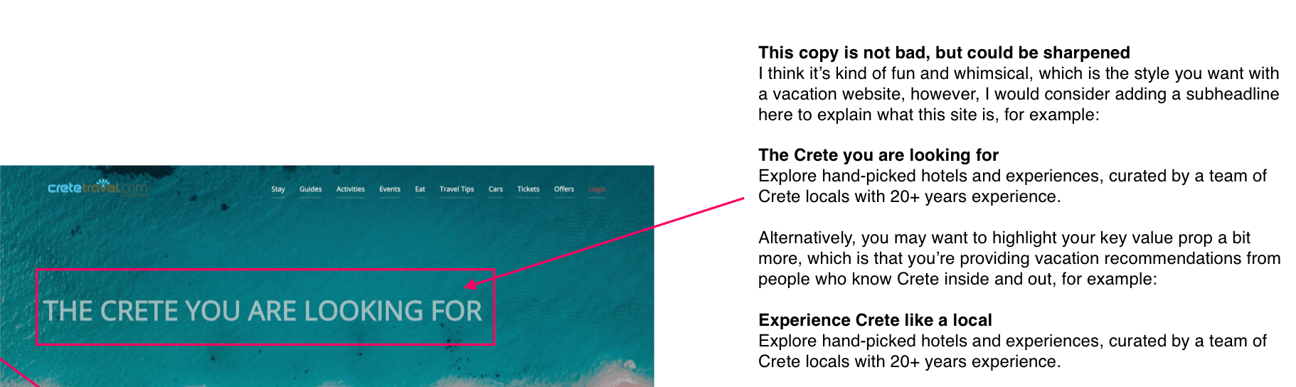
To help remedy that, I suggest they amp up the hero headline and subheadline to really focus on their key value prop, which is essentially curated vacation recommendations from people who know Crete inside and out.
Original hero copy:
The Crete you are looking for
Suggested hero copy:
Experience Crete like a local
Explore hand-picked hotels and experiences, curated by a team of Crete locals with 20+ years experience.
Tip #2: Clearly explain your product or service early and often
Similar to Tip #1, you must clearly explain what you’re selling and it must be easily understood as soon as someone lands on your homepage.
Don’t assume people already know what you’re selling and don’t assume that if you “just put it somewhere on the page” it will be read or seen.
Make sure it’s incorporated into your headline or subheadline in the hero copy and to reiterate it in other areas on the Homepage where it makes sense.
In the Crete Travel example, I suggest they do this both in the hero copy (covered in Tip #1) and by also adding a section just below the fold that more clearly explains what they’re offering and why someone should care about it, for example:
Hand-picked hotels & experiences by Crete locals
Experience the real magic of Crete — ancient ruins, breathtaking beaches, mouthwatering meals, local products, and more — all without ever feeling like a tourist.
This copy could be expanded further, but either way, the concept is the same: Be clear about what you’re offering and reiterate that message wherever it makes sense.
#3: Make your differentiators clear + scannable
Every business has competition, which means you need to clearly explain why your product/service is different and why someone should choose it over an alternative solution.
This is especially true within highly competitive industries like travel, clothing, pet products, software, beauty/skincare, health & wellness, and many others.
A great place to highlight your differentiators is on your Homepage, but it may also make sense to create some kind of “Why us” page to help you further highlight your differences.
In the Crete Travel example, they actually have their differentiators listed on their site, but they’re stashed away in the footer where they are unlikely to be seen or read.
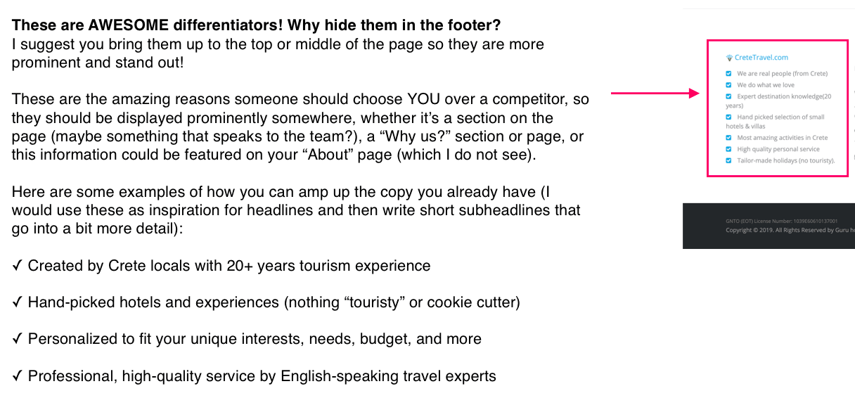
In my audit, I suggest pulling the bullets from the footer, rewriting the copy, then placing the updated copy into some kind of “differentiators” section on their Homepage, for example:
How Crete Travel is different from your typical travel site
✓ Created by Crete locals with 20+ years tourism experience
✓ Hand-picked hotels and experiences (nothing “touristy” or cookie cutter)
✓ Personalized to fit your unique interests, needs, budget, and more
✓ Professional, high-quality service by English-speaking travel experts
#4: Use descriptive CTA’s
An effective call-to-action (or “CTA”) clearly explains what a visitor can expect when they click a button on your homepage.
This means writing copy that’s clear, specific, and descriptive and avoiding copy that’s unclear, vague, or generic. Following this one simple rule is almost guaranteed to get you more clicks.
In the Crete Travel example, they actually do have some CTA’s that are specific and descriptive, but they aren’t always 100% clear, for example:
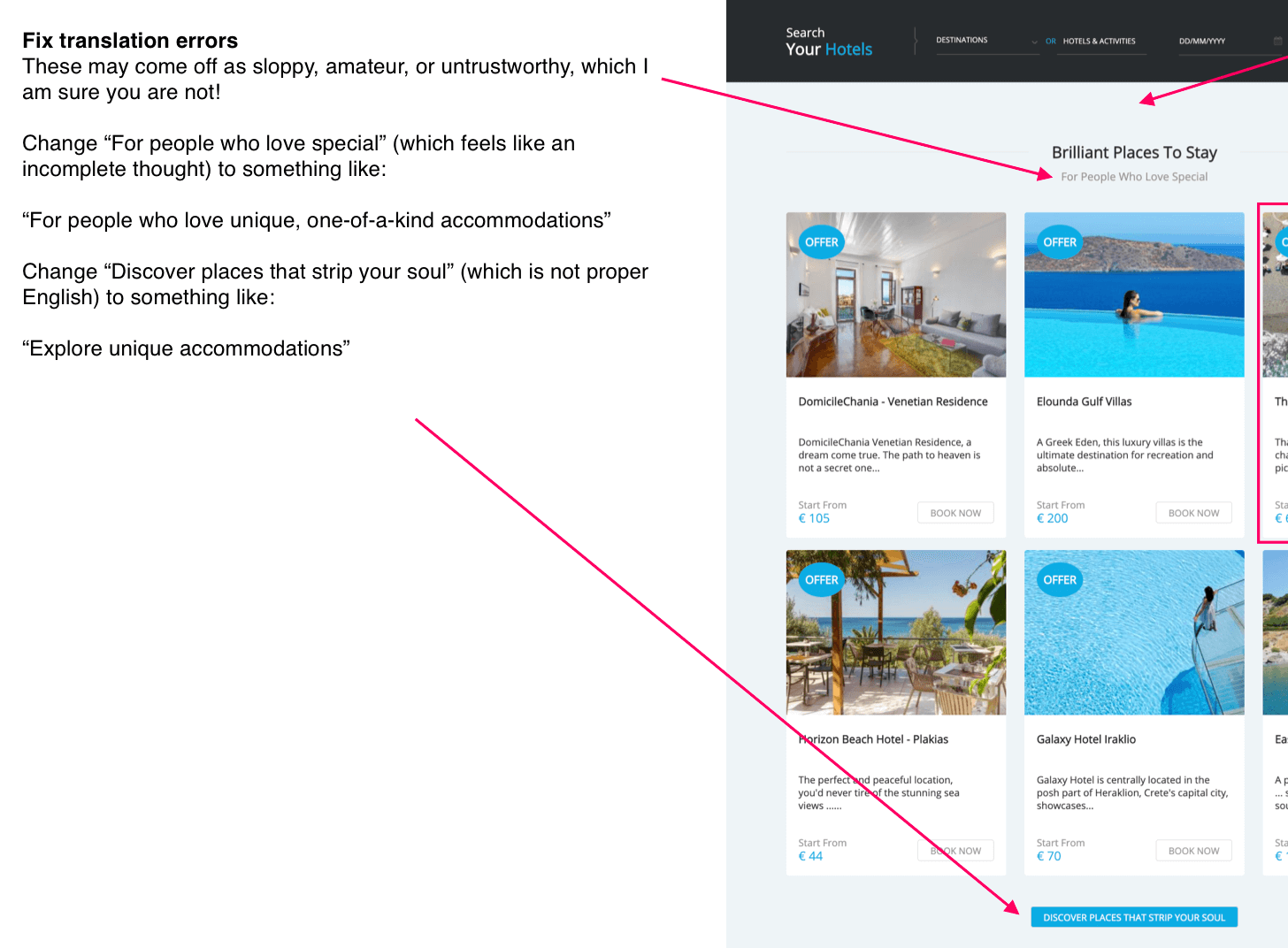
In this case, I believe the issue is related to translation (vs a lack of description), which is why I suggest they adjust this call-to-action to be clearer and more specific:
Original CTA copy:
[[ Discover places that strip your soul ]]
Suggested CTA copy:
[[ Explore unique accommodations ]]
#5: Use consistent copy conventions that promote clarity and scan-ability
One subtle way to build trust with your visitor is by leveraging consistent design and copy conventions on your homepage and throughout your site.
A convention allows you to establish a set of “rules” that the visitor can expect from you — when you stick to the rules, you send a subtle message to the reader that you deliver on what you promise (while also showcasing professionalism and attention to detail).
For example:
✓ Using a consistent design style or template so everything feels connected and purposeful
✓ Using copy that repeats the same core message while reinforcing what you’ve already claimed or promised
✓ Using copy templates that allow visitors to easily understand and compare products without doing mental gymnastics
In the Crete Travel example, I suggest they create consistent copy/design conventions for their hotel and experience recommendations, so visitors can easily compare them while also getting the information they need to make a confident decision:
#6: Incorporate proof when relevant
These days, featuring “proof” is pretty much a requirement of any site, but especially on the homepage or product pages where you need to build trust and persuade visitors to take action.
Proof includes anything that proves that your product or service delivers on what it promises, including:
✓ Star ratings
✓ Case studies
✓ Testimonials/reviews
✓ Before / afters
✓ Number of customers
✓ Number of years in business
✓ Logos from past customers
✓ Logos from media mentions
✓ Scientific proof (studies, research, etc)
✓ Support from influencers, experts, or authority figures
✓ Certifications and awards
✓ Guarantees
✓ And more!
On the homepage, proof can be woven in prominently or it can be done subtly. It can be done through design, through copy, or both.
In the Crete Travel example, I don’t mention a specific area where social proof may be woven in, but here’s a few examples of how they could leverage social proof throughout the page:
- “Rated 5/5 stars by nearly 5,000 Facebook fans”
- “Serving travelers since 2005”
- “Over 15 years of experience”
- “Over 10,000 trips booked”
- “Endorsed by the Greek Ministry of Tourism”
#7: Remove any unnecessary content or design elements
While it would be nice if every visitor scrolled through every element of your homepage, the reality is, most visitors are only spending a few seconds on the entire thing, which is why it’s so important to keep the page focused on the elements that really matter.
This means removing irrelevant and unnecessary content or design elements that may be getting in the way or stopping your visitor from seeing the important stuff.
I know this can be difficult, especially when it feels like “everything” is important, but that’s why it can be helpful to work with professionals who do not have your internal biases and can help you identify the right components for your homepage based on research, not gut feelings.
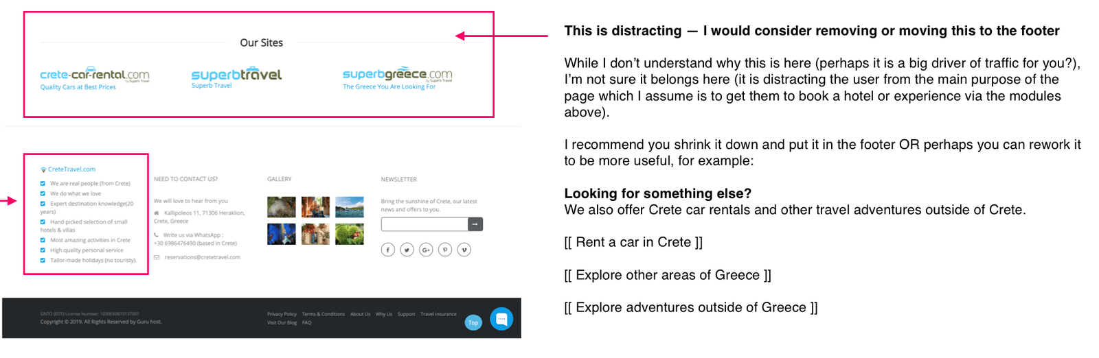
In the Crete Travel example, I suggest that they remove the “Our sites” section from the bottom of the page, as it did not feel as relevant as the other content on the page and could also be distracting people from the primary call-to-action (which is to book a hotel or experience).
If this is an important element to keep (I don’t know anything about their business, so it may be), I would just reframe it slightly so it feels less jarring and offers more context, for example:
Looking for something else?
We also offer car rentals and other travel adventures both in and outside of Greece. Need something else? Send us an email: reservations@cretetravel.com
[[ Rent a car in Crete ]]
[[ Explore other areas of Greece ]]
[[ Explore adventures outside of Greece ]]
#8: Use clear background images that promote legibility
Believe it or not, this is an issue I see over and over again: busy images with illegible copy, light images with white copy, or dark images with dark copy.
In general, I don’t recommend placing copy on top of images, especially busy images — copy works best when it’s displayed on a clear, crisp background without visual interference.
If you must place copy on top of an image, choose one that has negative space on the left or center with the visual elements relegated to the corner or somewhere that does not distract from the copy or make it illegible.
In the Crete Travel example, this was an issue I saw throughout the site which you can see below:
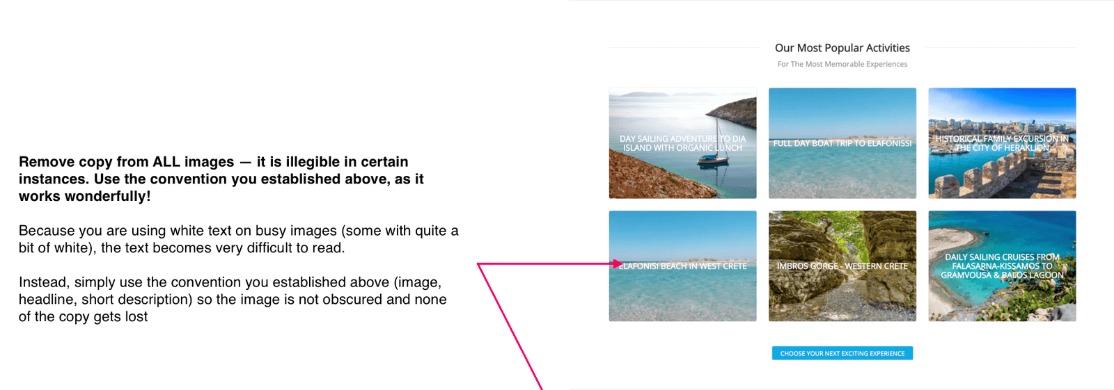
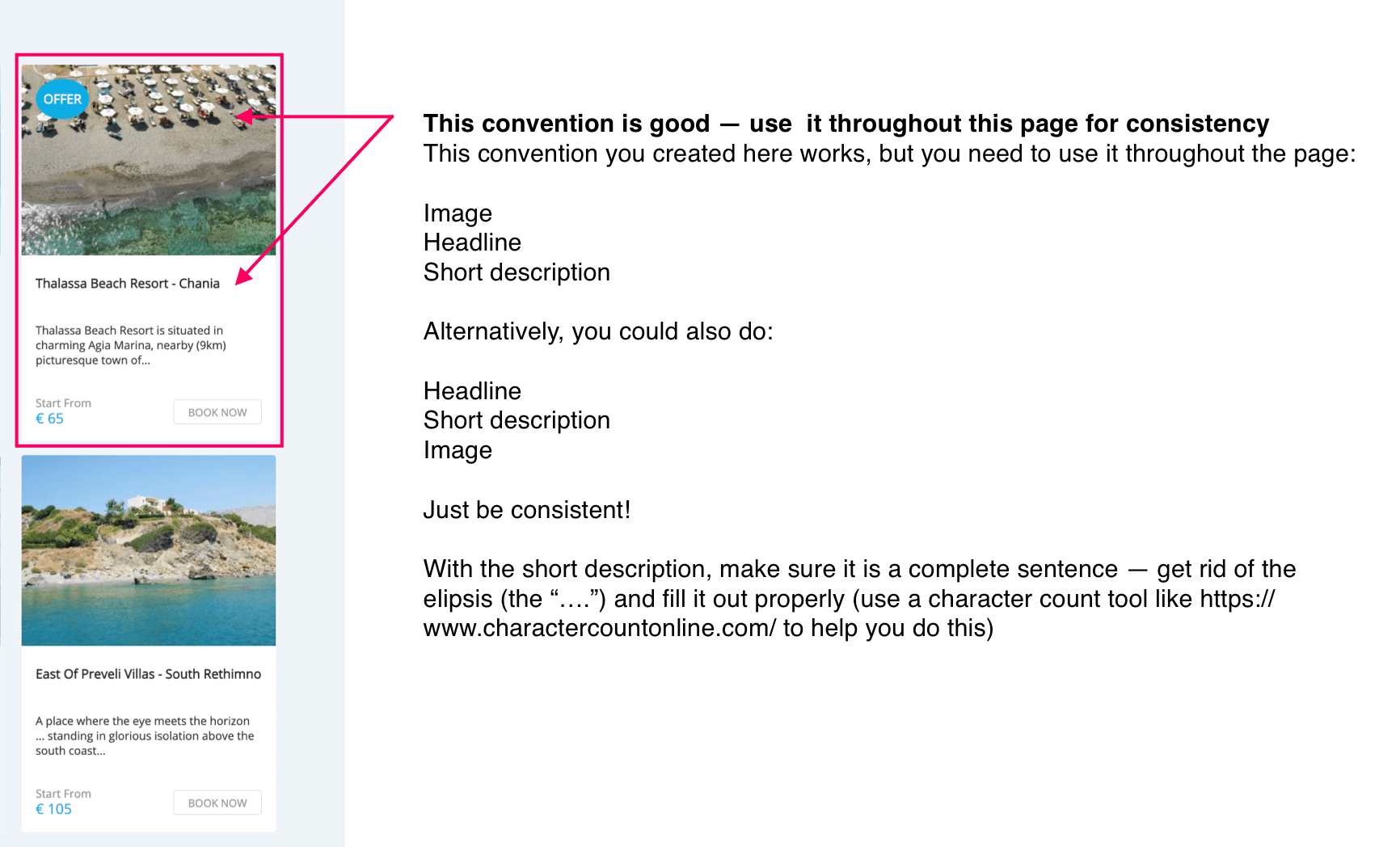
In this case, I suggest they remove all copy from images and adopt a consistent design/copy convention for their various offerings which they’re already using in their “Brilliant places to stay” section above.
The convention works like this:
- Image
- Headline
- Short description
Alternatively, you could also do:
- Headline
- Short description
- Image
With a convention like the above, we keep both the copy and visual element, but combine them in a way so neither is obscured and both are crystal clear (and presumably more persuasive, as a result).
Ready to audit your homepage?
You now have 8 simple tips you can use when auditing your own homepage or the homepages of your clients, competitors, and so on.
While I do not offer audits as a stand alone service, they are part of my research offering which includes a site audit, competitive audit, customer research, usability testing, analytics review, and so much more. If you’d like to work together, feel free to reach out (though please note I’m often booked months in advance): annie1maguire@gmail.com.
If you’d like to learn how to conduct effective audits (or you’d like to learn more about customer research in general), I recommend checking out my free guide here or my in-depth course on customer research here.
Happy auditing!


