If you’re trying to target a specific audience with a specific offer, a landing page can help you achieve your goals.
But how do you build an effective page?
What should it say?
How long should it be?
How should you arrange the content?
And so on.
If you’ve ever wondered about the above, I’m going to walk you through the exact steps I take when mapping out any landing page, whether it’s for my business or my clients.
Let’s dive in.
Step 1: Defining your goal
If you’re like most brands, your goal is to “sell more,” “make more money,” or “convert more visitors” and that’s great!
But what if your visitor isn’t ready to buy from you yet?
If this is the case (and in many cases, it is), that’s perfectly fine.
The goal of your landing page isn’t necessarily conversion every single time, and this is especially true if you’re targeting people who are higher up in the sales funnel.
Remember, the goal of any landing page is to move your visitor from one stage of the sales funnel to the next.
This means sometimes you’ll be moving someone from “Product Aware” to “Most Aware” (meaning they’re ready to buy) and other times you may be moving someone from “Unaware” to “Problem Aware” (meaning they’re just starting to recognize that they may have a problem that requires some kind of a solution).
Once you understand this foundational concept, everything else becomes a lot easier (and produces better results!) because you’re putting the goals of your visitor before the results you want to see.
You may be wondering: “Okay, so how do I blend my goals with my visitors’ goals?” and the answer to that starts with researching your visitor / target audience.
Step 2: Research your visitor
Before you can create an effective landing page that motivates and persuades your target audience, you must know everything you possibly can about that person.
But how do you get to know someone you’ll never meet? Someone who is essentially a stranger?
While it may seem impossible, there are many direct and indirect ways you can get to know your visitors; let’s dig in with the list below.
Start with your own site analytics
If you already have it set up (and you should) take a look at your web analytics to get a sense of how many people are visiting your site, where your visitors are coming from, how long they’re staying, which pages they’re visiting, and so on.
At the very least, you should have know the following data points:
✓ Traffic
✓ Referral sources
✓ Bounce rate
✓ Conversion rate
✓ Top keywords
Simply knowing the above should start to paint a picture of your visitors; even if that picture is still “blurry” that’s okay. This is just the first step.
Talk to your current, past, or potential customers
The best way to learn about your customers and gather Voice of Customer data (more on that here), is by talking with them over the phone or through online surveys.
To do this, start by making a list of people you may be able to chat with or engage; export your email list, make a list of your clients (current and past) or people you’d like to work with in the future.
Next, create your list of questions, which will vary based on who you’re talking with, how you’re engaging them (i.e. – survey vs interview), and what you’d like to learn. If you need help coming up with questions to ask, check out this article here.
Look to your customer reviews (or the reviews of your competitors)
If you have any customer reviews, read through them for insights about your customers. Many times, customer reviews will reveal things like…
✓ The initial problem they faced
✓ Other products they tried before trying yours
✓ The process they used to find a solution
✓ Challenges they faced or had to overcome
✓ Their experience using your product
If you don’t have any reviews yet, try reviewing social media comments on Instagram and Facebook or looking into your competitors reviews on Amazon, Yelp, Google, Trustpilot, or other sites where public reviews are posted.
If you spend even one hour reading through your competitors’ reviews, I guarantee you you’ll learn a lot about your potential customers and may even get some ideas on how to position your product in comparison to alternative solutions (look at the negative reviews for those ideas).
Study their on-site behavior
One of the best indirect ways you can learn about your customers is through specific tools that track on-site behavior.
For example, Hotjar offers tools like heatmap analysis and on-site recordings that show you how visitors are engaging with your pages/content so you can get a sense of where they’re paying attention and where you may be losing them.
You can also take it a step further by installing an on-site poll to gather feedback from visitors or by using a live chat tool to engage visitors while they’re active on your site.
Polls and live chat will give you the opportunity to engage visitors and learn more about who they are, why they’re there, and what they’re looking for.
Step 3: Translate the data
Once you’ve collected all of the various data points, it’s time to translate that data into a meaningful format you can use to lay out your landing page.
Let’s start with the basics.
If you want to know how long your landing page should be, what kind of content you should focus on, or what you should be offering them, you must know 3 key things:
✓ Referral source
Where are visitors coming from? How did they arrive on your site or landing page?
✓ Stage of Awareness
How familiar are they with your brand/product/solution?
✓ Level of Intent
How likely are they to take action? How badly does their pain hurt?
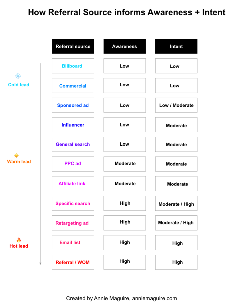
From Step 1, you should already know the referral source of your visitors, which can also give you insight into your visitors’ stage of awareness and level of intent.
Take a look at the visual below to see what I mean:

While this visual isn’t perfect (as everything can vary by brand, product, marketing strategy, etc), it should give you a general sense of how you can infer certain things about your visitors just by knowing how they’re getting to your website.
Now, you may be wondering: How does knowing the referral source, stage of awareness, and intent help me lay out my landing page?
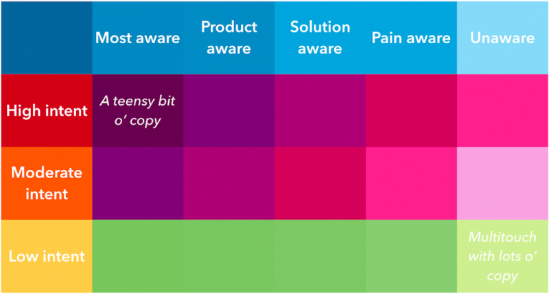
Take a look at the visual below from copyhackers (10x landing pages), which demonstrates the direct relationship between position in the sales funnel and page length/amount of copy:

As you can see, knowing your visitors’ stage of awareness and level of intent will help you answer questions like, “how long should my landing page be?” and “how much copy do I need?” with ease.
Once you know the above, figuring out what kind of content you should be focusing on and what product to offer them becomes a hell of a lot easier.
Step 4: Choose your content & offer
By this point, you should be able to confidently answer the following questions:
✓ Where are my visitors coming from?
✓ What do I know about my visitors?
✓ How familiar are my visitors with my brand/product/service?
✓ How likely are my visitors to take action?
If you’re good on the above, you can move on to figuring out which content to put on the page.
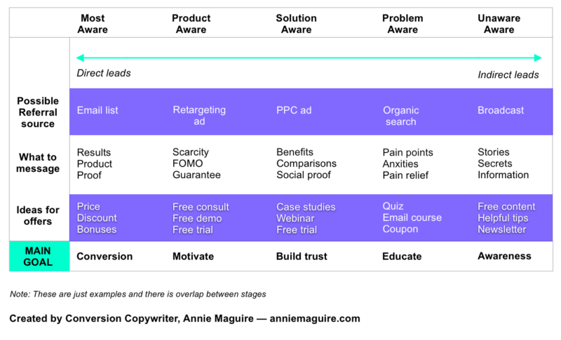
Again, knowing exactly what to put on the page comes back to where your visitor is in the sales funnel. To show you what I mean, check out the visual below which gives you a bit more insight into how this all works.

As you can see, it doesn’t make sense to present someone at the top of the funnel (an indirect lead) with a HIGH BARRIER offer to purchase your product. It doesn’t mean you can NEVER present that offer, but now is not the time.
Instead, it makes more sense to capture their interest with a LOW BARRIER offer like a free download or some kind of incentive (i.e. – “Enter your email for a 15% off coupon code”) then work up to the sale by building trust and offering value over time.
Alternatively, if someone reaches out to you directly and wants to hire you for a consulting gig, it wouldn’t make sense to push them to a “Free guide” — they’re already interested and intent on taking action, so therefore, you want to schedule a call to learn more about how you can help them or give them a quote.
If you’re interested in learning more about how to choose the right offer for your landing page, check out this article here which goes more in depth and includes many more examples of potential offers.
Step 5: Arrange the content
By this point, you should know who your visitors are, what kind of content you need to move them to the next stage of the sales funnel, and what kind of offer they’ll be most interested in.
It’s now time to arrange the content in a way that hooks your audience and moves them toward the point where they’ll accept your offer.
During this process, don’t worry too much about design or general aesthetics. You’re really just trying to get a sense of how the page will come together vs how it will ultimately look.
Match the hero content to your visitors’ position in sales funnel
When visitors land on your page, you only have seconds to capture their attention and get them to keep reading, so the hero content is very important.
Regardless of what the copy says or what the design looks like, you want to make sure that the content you feature in that area matches your visitors’ position in the sales funnel.
For example, let’s say you’re selling an alternative to charcoal toothpaste and you’re targeting people at the top of the funnel. Because those folks are low awareness and low intent, you’ll want to hook them with something interesting related to your product vs offering them the solution.
In that example, you could run an Instagram ad that hints to the reader that there’s a terrible secret that they don’t know (but absolutely should).
EXAMPLE AD COPY
“Did you know The ADA has not approved ANY activated charcoal products for dentistry? A dentist explains the SHOCKING truth…”
Once you hook them with the ad copy, you could drive to an educational-style landing page (or blog post) that exposes the truth, supported by scientific claims, research studies, stories, etc or whatever supports your position.
Remember, you don’t want to push your product…yet. You just want them to become aware of the problem and your brand / position.
EXAMPLE LANDING PAGE COPY
“The SHOCKING Secret Popular Charcoal Toothpaste Brands Don’t Want You to Know…”
“If you’re on Instagram, chances are, you’ve seen a so-called influencer sporting black teeth followed by a pearly white smile.
But according to Dr. Anita Hayworth DDS, the truth behind the ingredients is nothing to smile about (and then go on to flesh out the page with more related facts, content, etc)….”
Once you prove your point, you’ll want to leave the reader with some kind of “offer” or “call-to-action,” whether it’s to read more content on related topics, to subscribe to your newsletter for similar content, to download a more extensive report, and so on.
Copywriting formulas
One of the best (and easiest) ways to figure out the structure of your content is to rely on a proven-to-work copywriting formula.
For example, one of the most common copywriting formulas is “P-A-S” or “Problem, Agitation, Solution,” which, if you decide to use, will give you the structure for the first 3 sections of your landing page.
There are hundreds of copywriting formulas you can use right now — if you’re interested in learning more, check out this “ultimate list” from Copyhackers which features the most popular ones.
Best practices
If you’re trying to optimize a page for conversion, there are certain best practices you’ll want to keep in mind while laying out the content.
Here are some of my favorites that are easy-to-understand and implement:
- Write for ONE reader — Your landing page is targeting a specific type of person, it is NOT targeting everyone, so make sure to write for that ONE person.
- Include ONE offer — Make sure your page is driving toward ONE offer, not multiple offers (you can have multiple CTAs/buttons, but they must be the same offer).
- Ensure Message Match — Make sure your ad copy matches the hero copy of the landing page (this assures the visitor that they are in the right place and may reduce bounce, as a result)
- Add social proof in the right places — In general, if you make a claim, you need to support that claim with social proof (i.e. – adding a testimonial next to a claim or stacking several testimonials beneath a “solution-focused” content section).
- Break up the text — Avoid heavy blocks of copy, long paragraphs, etc and instead, opt for shorter sentences, bullets, and visuals that can help to break up the copy and make it more scannable.
Put everything together
Throughout my years as a freelancer, I’ve found many different methods to be useful when laying out content, from sketching on a piece of paper to using fancy design programs.
But I would say that the chart below is the easiest way for ANYONE to layout the structure of their page (just FYI, the chart below is for example only):
Page structure (for internal-use only) | Suggested copy (customer-facing) |
Problem | Headline lorem ipsum Subheadline lorem ipsum lorem ipsum lorem ipsum. [[ CTA ]] |
Agitation | Headline lorem ipsum Subheadline lorem ipsum lorem ipsum lorem ipsum. |
Solution | Headline lorem ipsum Subheadline lorem ipsum lorem ipsum lorem ipsum. [[ CTA ]] |
Testimonials | “This is a quote from a testimonial” “This is the rest of the quote so it tells a story lorem ipsum lorem ipsum lorem ipsum lorem ipsum.” -Name of person, title, company (+ add headshot) |
How it works | Headline lorem ipsum Subheadline lorem ipsum lorem ipsum lorem ipsum. (1) Lorem ipsum Step 1 (2) Lorem ipsum Step 2 (3) Lorem ipsum Step 3 |
Testimonials | “This is a quote from a testimonial” “This is the rest of the quote so it tells a story lorem ipsum lorem ipsum lorem ipsum lorem ipsum.” -Name of person, title, company (+ add headshot) |
On the left, I have a column with the page structure listed out so I remember what should go where; I usually add notes in that column regarding specific content I want to focus on and/or notes for the designer. This side is for internal-use only (meaning the visitor never sees it).
On the right, there is a column that is just for the copy (headlines, subheadlines, buttons, etc) and any design elements I may need to include to help me (or other people) visualize the page.
Feel free to copy and paste the chart above into your own documents and adjust as needed for your project.
Ready to lay out your landing page?
You now know that building an effective landing page does not come down to guessing or personal preference.
It’s truly about using your customer data to shape an experience that matches your visitors’ mindset, expectations, interest, and more.
If you need help building more effective landing pages, feel free to reach out to me directly: annie1maguire@gmail.com.
